

Visual Data Representation
I was tasked with creating a infographic poster that visually represented that data on a chosen topic. This project was completed using Adobe Illustrator.

Infographic Poster Mock-up
Challenge
Create a visually engaging infographic that also clearly conveys the data that it is based on.
Process
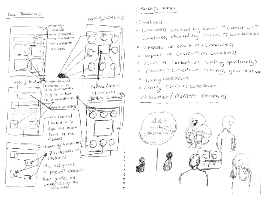
Initial Sketches
As a result of the lockdown in Canberra, loneliness became a common issue. With that, loneliness was the focus of the project. The initial sketches found that the inclusion of the images/illustrations that convey loneliness, would invoke empathy and create an emotional impact from the viewer.
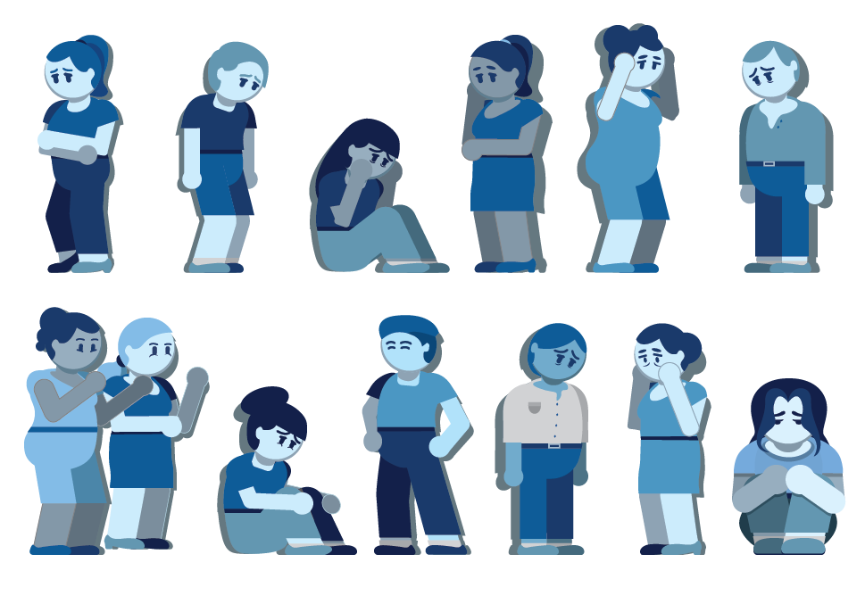
Figure Designs
The figures were all created with the intent of demonstrating the different emotions and behaviours towards loneliness and those experiencing loneliness.
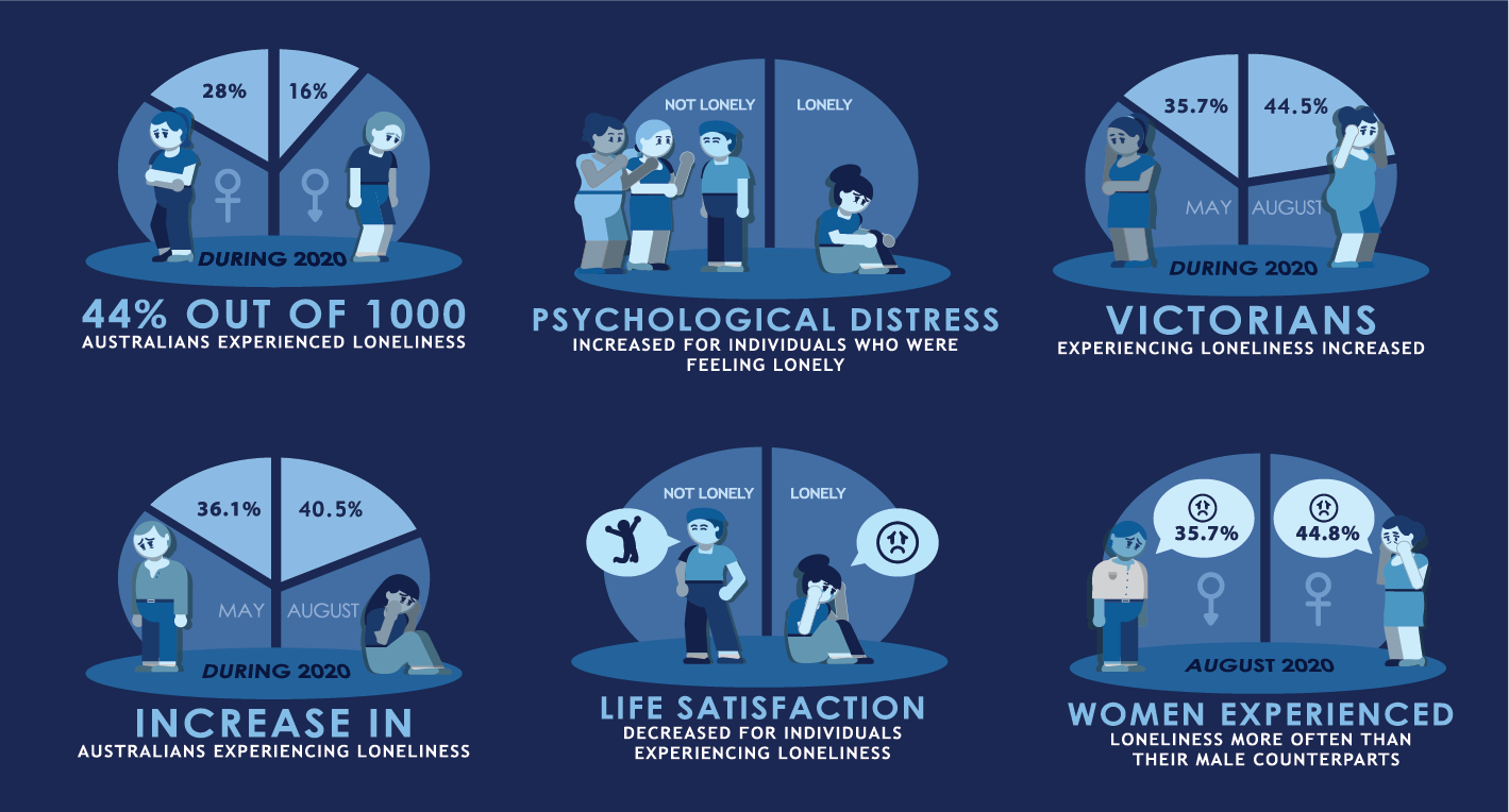
Statistic Designs
After researching about key statistics on loneliness (from Australian Institute of Health and Australian Bureau of Statistics), I created a platform for the figures. The platform also displayed statistical ratios as well as a common theme among different facts.

Final Infographic Design
The final design incorporates all statistics on the sides of the poster. This is to maintain attention on the central figure. The central figure is the key element that draws that catches the attention of the audience first. Along with the heading, the figure is one of the brightest elements on the poster while every other feature has been muted in comparison. The text used ensures that the information is legible for the audience.
Takeaways
This project was a good experience as it tested me in how I could communicate dry text statistics into a visually engaging solution. I believe this project was completed successfully and has become a skill developing experience.